For many job seekers, your career portal would constitute the very first touch point with your company and it’s essential that you get off to a good start with them. In fact, 64% of candidates consider career sites the most valuable resource when researching new opportunities.
Your career portal therefore, must hit the nail right on the head. For that, you need to make sure your career page shines on every front. Job seekers have dropped by your page seeking certain information and you need to ensure that you’re providing them satisfying answers.
Your copy is one of the main determinants of the value that your visitor will gain from your page and arguably the key component they will base their judgement on. In fact, poor or outdated content on a career page is one of the main reasons for its high bounce rate.
Preparing copy for your career portal is by no means complicated. However, it does come with a set of definite do’s and don’ts.
Here are some guidelines you must follow to write crisp and watertight copy for your career portal to help you maximize the conversion rate of your career site.
Speak the Language of your Brand
Every brand has a certain persona that reflects in the content they produce. Scroll through your company’s website to understand the tone that your company assumes. Is it strictly professional and formal? Does it veer toward light and friendly? Or does it strike a comfortable balance- not too casual but personable nonetheless?
Once you feel you’ve correctly gauged that signature tone, try to capture it in your writing. It’s vital that your career portal matches the tone of your website to ensure that there is consistency across the brand.
Let’s go through some examples to clarify this.
Here’s a chunk of text taken from Bain and Co’s Career page:

You can see that the tone employed here is thoroughly proper and formal – almost clinical in fact, to reflect the reputed consultancy firm’s very professional brand image.
Now, compare this with the copy on Tasty’s career page:
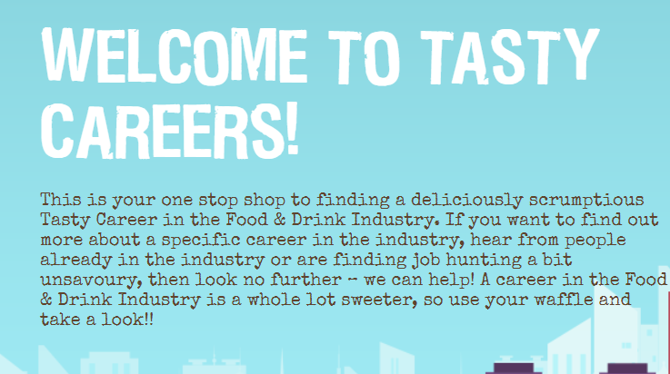
Contrary to Bain and Co’s tone, this is much more informal, relaxed, and friendly, because that’s just what the brand is about! It’s fun, quirky and the food puns very effectively showcase the fun-loving spirit of the company.
And then, there’s Air Bnb’s career site copy:
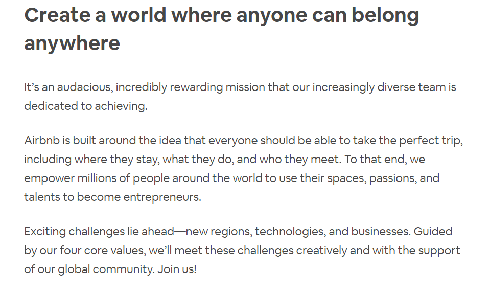
This is a great example of a nicely balanced tone. It’s not too formal but not completely casual either. It’s personable and attempts to establish an intimate connection with the reader but at the same time refrains from sounding too jaunty.
Keep it Brief
When preparing copy for your career portal, it’s important to understand what kind of readers you’re dealing with. Web readers are anything but regular readers. They’re restless, impatient and hungry for quick shots of information. They aren’t reading for luxury but in fact to find a specific answer to a specific question. Likelihood, therefore, is, that they’ll only quickly scan web pages instead of diligently taking in every word. In fact, research suggests that only 16% of people read web pages word for word.

Thus, the key when preparing copy for your career portal is to keep it concise and to the point. Avoid writing long, complex sentences. Keep it short while also ensuring that you have conveyed everything of significance and relevance. Brevity always packs a stronger punch.
However, it’s also a skill that comes with practice. If you have trouble creating impact in fewer words, try producing a first draft, and then review it to see what you can do without. Repeat the process until you’re sure that you’ve condensed and polished the draft to your satisfaction.
Here’s an example:
This is the first body of text you see when you open Pinterest’s career page:

This is a short, well-phrased sentence that succinctly summarizes the vision that drives Pinterest.
Now imagine the same idea being conveyed something like this:

Sure, this sentence is essentially communicating the same idea, but does it bring the same impact? Not really. Pinterest drives home the same point much more sharply, using one word where they could easily have used three. The end result? Brief and to the point copy establishes a more immediate connection with the reader, allowing them to grasp the gist more quickly and effectively. Simply put, concise content is just much more powerful!
Important Information First!
We’ve already established that your job seeker is probably impatient and wants to acquire all the necessary knowledge about your company at the speed of lightning. A career page where they have to sift through lengthy copy to find the relevant answers is incredibly frustrating.
It’s best therefore to always begin with the key points. Don’t spend time beating around the bush or creating suspense and instead, get right to the point. Once you’ve stated the central message, you can then supplement it with details. This way, even if your visitor just glances through your page, they’ll still manage to get the gist of things.
Keep it Simple!
It’s also equally essential to keep your copy easily digestible for the average reader. Resist the urge to use needless modifiers, flashy vocabulary or complex jargon. This can often be jarring for the reader and your message is likely to get lost amidst all the fluff. You want your message to reach the largest number of people, so it’s best to keep the language as accessible as you can make it.
The trick is to strike a nice balance- Keep it powerful but not overwhelming, simple but not too loose! Again, that’s no rocket science, but a skill that comes with practice. And of course you know the drill- Practice always makes perfect!
Typography Plays a Role
You also want your copy to be visually prominent and readable; visitors shouldn’t be squinting too hard to read the content.
When preparing copy for your career page, pay particular attention to the typography- the font style, size, color, spacing etc. Highlight in bold or italicize important points to add some character and zing to your text. These tools serve as refreshing breaks amid dull blocks of text and bring immediate emphasis on central topics. Here are some tips for getting your career site typography right:
![]()
- Type headlines in a big, bold font
- For the rest of the text, Serif font is the most commonly used, though you could go with any font that is readable and has distinguishable letters. Just remember it’s best to go with a standard font
- Keep the number of fonts you use to a minimum. Definitely not more than 3.
- The font families you use should complement each other and not be wildly different
- Limit line length to 60 characters per line and 30-45 for mobile-friendly career pages
- Avoid using all caps
- Make sure there is adequate spacing between lines
- Make sure the color contrast sits well
- Don’t use glaring or flashy colors too liberally
Never Rely Solely on Text
Copy that is only text-driven is extremely boring and quite likely to repel readers. They’re unlikely to enjoy endless chunks of plain black and white text if that’s all there is to your copy. Instead, pepper it with interesting and colorful visuals to break the monotony. Content that combines text with visuals is statistically proven to be more compelling and engaging than text alone.
![]()
The Importance of Video
Employers are beginning to discover the amazing potential of video for good employer branding, that in turn can attract a greater number of job seekers to their brand. Research suggests that having a video on your landing page can increase your conversion rate by 80%. Therefore, incorporating a video into your career site is a definite must that can markedly boost the value of your content.
You could go with a corporate video that gives an inside look into your organization or showcases its culture and employee relations. Alternatively, you could include an employee video testimonial, which is considered a fantastic exercise in employer branding. Dedicated employees can share their story or their experience with the organization in the video. Not only do such testimonials feel authentic, but they also offer a window into the promise that the company holds for the job seeker.
Must-Have Items for your Career Site
To help you set the foundation for your career site copy, we’ve prepared a brief checklist of the essential items that you must address on your career site.
- Company Overview
- Company Values, Mission and Goals
- Company Products, Businesses and Partnerships
- Global Presence/Locations/Workforce Distribution
- Culture/Corporate Video
- Employee Testimonial
- Overview of Application Process
- What to Expect/Learning opportunities
- Job Search
- FAQs
- Customer support
Note: A great practice when preparing copy is to draft multiple samples for your career site and then run an A/B test on them. This will help you determine which version is driving the most engagement and has the highest conversion rate.
With this method, there’s a range of elements you can test – from images, formatting, positioning, to the text itself. A/B testing is one of the most tried and tested methods for improving conversion rates, and you definitely don’t want to skip this step when finalizing your career page copy!
Conclusion
The success of your career portal page will ultimately boil down to how well your copy is engaging the visitor. And as we mentioned before, the effectiveness of your copy has a direct impact on the number of job seekers who’ll end up hitting ‘apply’ on your career page.
Coming up with great copy is quite an important job therefore, but no need to sweat it! You don’t need to be a seasoned writer or a literary genius to write effective career page copy. As long as you stick to these guidelines, keeping it simple, clear and yet meaningful, you can rest assured- you’ve mastered the art!
 Find Top Talent Faster with the most advanced CV Search yet -


