Hiring the choicest candidates who add value to your company and can imbibe its culture is one of the main priorities of every company. If you’re looking to attract the crème de la crème from the enormous, ever-growing pool of candidates today, you need to make sure that you are providing a recruitment experience that is seamless, insightful, and above all, so comfortable that it feels like a breeze!
Today, the recruitment landscape is in the throes of change. Traditional recruitment practices that involved manual procedures and physical effort are fast becoming obsolete. Recruitment has largely become a digital affair and companies are attempting to develop state of the art online career portals as their prime talent acquisition tool.
How your organization’s portal fares in drawing candidates will depend largely on the landing page’s aesthetics and the range of features it’s offering. Not sure how to go about developing a mind-blowing career portal page? Don’t worry, we’ve got you covered!
Here’s a list of the key elements you need to consider when designing your page:
1. A Solid First Impression
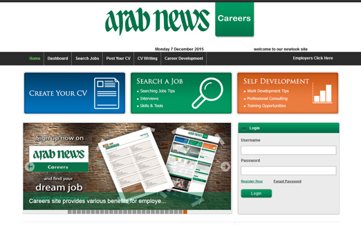
Your career portal should visually be striking. There’s a multitude of career portals out there, each committed to pulling in the best talent and vowing to be the obvious ‘employer of choice’. What makes your portal stand out amid this sea of ravenous competitors?
It’s vital to deliver a solid impression if you want to immediately hook in the candidate and keep their interest from shifting elsewhere! Work diligently on the aesthetic appeal of your page, planning it down to the minutest details- text, graphics, font, colors, placement, etc.
Arab News’s career page packs a solid punch with its well-crafted design, striking color palette and just the right balance between text and graphics!
2. Pleasant Visitor Experience
What criteria should you employ when planning the layout and design? The answer, of course, is plain and simple: Keep in mind the candidate. Your candidate, should be at the front and center of your dedicated recruitment solution. Your priority is to ensure that they are not only tempted to keep exploring, but that they also have a comfortable experience while they’re at it.
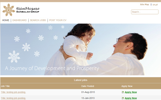
Your portal should thus have a user-friendly interface, with an attractive layout. Keep the colors and graphics pleasing to the eye. More importantly, the page should be easily navigable and simple to understand. There’s nothing more off-putting for a job-seeker to finally zero in on one portal among a range of them crowding the internet, only to find its layout complex and cluttered.
Try also not to overwhelm the candidate in any way- refrain from squeezing in too much text or an unnecessary amount of flash! Keep it simple, but also keep it classy!
Sunbullah Group’s career page for example makes use of a simple yet attractive design- the colors are light and soothing, and the design minimalistic. The browsing options available to the visitor are also neatly categorized and visible to ensure that they do not have trouble exploring the site.
3. Employer Branding
This one’s important! Your career portal should essentially be YOU. A career portal projecting an impersonal image won’t get it more than a cursory scroll. To draw in the candidate, make sure your portal has a character – one that best represents the ethos of your company.
Remember, job seekers, especially those fresh in the market, are more particular about the company they want to work at than the position they’re applying for. It’s important therefore that your portal page adequately reflects your company’s values and can offer deep and exciting insights into its culture.
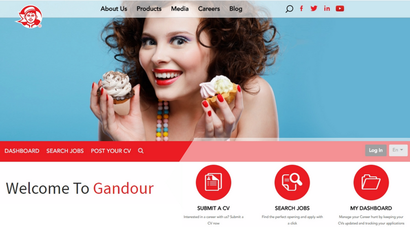
Keep the colors and graphics relevant, and perhaps also integrate videos or employee testimonials that provide a quick peek into your company’s culture. You could get your ATS provider to send you some suitable templates, or preferably, you could have a design tailored exactly to your requirements.
Additionally, keep in mind that your career portal should be an extension of your company’s website so there is a sense of consistency across the brand.
Gandour’s career page, for example, is essentially its culture on display! The creative use of colors and the candid pictures of employees showcase a culture that’s all about fun and work in equal measure!
4. Ease of Navigation
Here comes the chief aspect of the job seeker’s experience with your portal: the job search. If you’re unable to offer a search experience that is extraordinary in terms of the ease, convenience and features it offers, you’ve lost the candidate, potentially one who was just the right fit for you!
So how can you enhance the searchability features in your portal?
Here are some helpful tools that you might want to consider integrating into your page:
– CV Creation: Adding a CV to your portal should come with plenty of options for the candidate. For example, they could upload it from their device, import it from other job sites such as Linkedin, or build one within the portal itself.
– Job Search: It’s important that the search box should feature prominently on your page. Moreover, the candidate’s search for a suitable job can be segmented according to title, department, location, experience etc to help them quickly and efficiently identify a vacancy that suits them perfectly. Abdul Latif Jameel’s career page for example, provides plenty of options for the visitor to segment their search:

– Job Details: Candidates are often fussy about job descriptions and want a comprehensive overview of what the position entails before they apply. Integrating the option of downloadable PDF files on your portal can assist them in this endeavor.
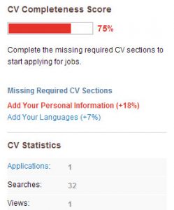 – Feedback through Gamification: With this feature, candidates can get an accurate assessment of the status of their CV and performance of their profile through quantifiable metrics. Such assistive tools can help the job-seeker take corrective action and thus optimize their job search.
5. Customer Support
No matter how easy to understand and user friendly your portal is, it’s quite likely that some candidates might have queries regarding navigation and job postings. Digital recruitment solutions are still a fairly new phenomenon that are as tricky for the candidates to wrap their head around as they are for recruiters.
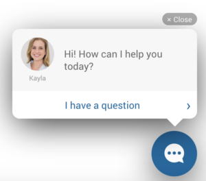 It’s essential therefore that your page should have multiple customer support tools to resolve the job-seeker’s confusion. For example, there could be an option to directly reach out to HR, or you could build a chatbot into the portal to immediately respond to queries. Such a personalized feature is always instrumental in effectively engaging the candidate and developing a positive perception of your company.
Of course, there are multiple other features that you can consider when designing your portal page. There’s no end to innovation within the digital sphere. Just remember to always think from the perspective of the job-seeker and see how you can best provide them with an experience that is easy as well as immersive, and you’re good to go!


